It is always an exciting moment in the preparation for a new WordCamp Europe when the design and branding is revealed for the first time.
It is fascinating to see what goes on behind the whole process of a piece of design and so we have asked the design team – Roberto Tuñón, Tammie Lister, Flavia Bernárdez – to give us an outline of the behind the scenes work that has gone into making our WCEU 2021 brand.
The design team focused on balancing both professional and high impact. The focus was on crafting something that had a familiarity, ease and connected to everyone.
The initial brief
All good design starts with a brief and this one was no different. The design team worked together on every stage of this process including the brief, which had these starting points:
Simplify it
Design should be as simple as possible. By removing overloaded elements, the content itself can be more easily understood by everyone.
Celebrate it
A strong visual design celebrates the festival that is WordCamp Europe. Our community has an opportunity to come together remotely in celebration during this event, so the design should reflect this.
Make it accessible
It is crucial that no matter what your ability access to the design should be given. The team has taken great care and continues to listen, learn during this process how they can improve the accessibility of the design.
Legacy of last year’s edition
In creating something new, it doesn’t mean the past design should be forgotten. This year builds on the work of the past year. In the last edition of WCEU the design team rethought the branding of the event and created a robust language.
For this year’s edition, we have maintained this style, building on from it. This evolves the branding and keeps it recognizable. The adaption made is to simplify the logo as this is an online event.
Brand logo
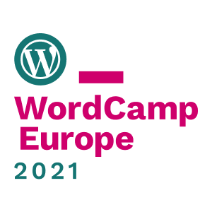
Continuing this legacy, the logo is based on a dot, which represents each individual member of this huge community, containing the symbol of WordPress, since we all carry it inside.
This dot is followed by a rectangular shape that represents an underscore, a symbol of continuation, of mutability, of being open to write new episodes, to create new things, that’s how it happens in every edition of this great event.
The logo is provided in 3 different versions to be used in different applications, depending on the size and the need for brand presence, but keeping its main essence in all of them.


These same concepts continue into the backgrounds, with repeating dots to represent the groups of people across the European WordPress community and beyond.
Colours
Colour is just one part of the branding for a WordCamp, so it’s important to note that it goes with the other elements brought in.
This year 2 prominent colours were used of: magenta pink and dark aqua green.
These colours were distilled from numerous palettes focusing on accessibility and vibrancy. The idea was to have a range of hues that could have a strong impact and warmth, welcome to as many as possible, but energise.

The process
Team design processes can be an interesting experience as everyone gets to know each other.
This year the team was small and every single person came to it with their own ideas. A lot of directions were explored, but none were standing out as the right one.
After some recent changes in the team (@estelaris we miss you!) a very interesting process was implemented that led us to the final design.
For a whole week the team members played “PingPong” of design iterations based on some already agreed foundations over a shared Figma file:
- Each of the team members had a day to put forward their vision of the website homepage design, applying colours, layouts and type sizes that best fit their vision.
- Once that proposal was finalised, it was passed to another team member to make a new iteration based on it.
To keep focus, feedback was only on things to take into the next iteration, each team member communicated with their design.
This was probably the best experience yet in creating the design and we’d highly recommend it for others when they need to rapidly craft something with diverse designers. Particularly, the rule of focusing on positive things to take into each iteration really helped move the design on rapidly.
So, that’s the story of the design for WCEU 2021.

